WCAG + Samurai

The WCAG Samurai Errata to WCAG 1.0 is an independently-produced set of amendments ("errata" is not really the right word) that fairly accurately nail how WCAG is and isn't working for pragmatic but standards-compliant developers like me.

I stumbled across this while browsing Google for references while writing a proposal for a client. I was writing my usual set of caveats about the Web Content Accessbility Guidelines (WCAG), in which I lament how rubbish they are in practice. My usual spiel goes along the lines of "WCAG 1.0 informs all of our work at Mauve Internet. However, because the WCAG is subject to intepretation, and is now somewhat dated, we do not warrant conformance." I would like to make a clearer statement of how and why but a specification isn't really the place to challenge sections of the WCAG.

Happily, I can now get rid of this kind of non-committal note when writing specifications, and offer a firm commitment to WCAG+Samurai.

I will also be revising my company website - indeed, my company policy - to recommend conformance to the WCAG guidelines as amended by the WCAG Samurai Errata where possible.

Tip: Photography for the web

What with the summer weather finally here and some good light, it's a good time to be taking photos.

While I do encourage people to take nice, artistic photographs, and include them on a website perhaps in a frame, this is ultimately limiting. If you would like to end up with photos you can use within the design of a website, you need to take a different approach to setting up your shots. The composition will be done using graphics software at a later date, so you need to avoid doing the composition when you're in the field.

The following guidelines are based on the main reasons I have to rule out a particular photograph as suitable for a piece of graphic design.

Don't crop the subject

It may look artistic if the subject extends out of the frame, because it places the subject better in frame and leads the eye in the opposite direction. But it's the number one reason for ruling out photographs from a layout. With no cropping of the subject, the designer can place a photo anywhere and composite the subject into the layout. With one edge running through the subject, the designer is constrained to place that edge along a natural edge in the layout, or failing that, hide it behind something else. With each additional edge that runs through the subject, the designer is more and more constrained with what can go where.

Don't take black and white shots

It's easy to convert colour photos to black and white on a computer; the opposite is not possible. Take colour photos just in case you need them.

Use a mixture of different shots

Most photographers will take multiple shots of a subject, but often this will just be a process of refinement - to try and capture one excellent photograph. You should aim for a much more varied mixture, of portrait and landscape, wide-angle and close-up, different angles and so on.

Try and take the same shot of different subjects

Designers will often be creating a suite of graphics to work together, so take similar shots of different but related subjects.

Include acres of background in your shots

In artistic photography you're told to put the subject off-centre in the picture, roughly a third into the frame.

In web design we often have very long or tall regions to fill, quite different dimensions that you might encounter in print design. The aspect ratio of the photos that we might be putting on a website is rarely 16:9 let alone the traditional 4:3. We're more likely to deal with aspect ratios of 10:1.

To successfully frame photos that can be cropped to a very wide or tall aspect ratio, your subject should be much smaller and nearer the edge.

Don't use depth of field effects

A short depth of field can really 3D effect to a photograph. But it is difficult to cut out something that's blurry, and sometimes that's what designers want to do. A blurry background isn't a problem, as part or all of the background may be removed, but when parts of the subject extend out of focus it's impossible to separate the subject from the background.

A designer can fake a depth of field effect if the subject is in focus.

Don't strive for contrast

As a rule of thumb, artistic photos look best with dark darks and bright highlights. Nearly all B2B and the majority of B2C websites are dark text on a pale background, and the dark darks contrast too much with the light and airy environment of the average website. That's something that you can't actually fix with colour curves as you can only produce murky greys. A subject that is mostly well lit but fades to black is as hard to work with on a pale website as one that is blurry or cropped: there's no good way to blend the dark bit into the site.

If your website is on black or dark grey, you're in luck. These are ideal for publishing artistic photography and really good contrast will look stunning.

SVG filters with Inkscape 0.46

One of the most stunningly powerful features of the recently release Inkscape 0.46 is the ability to design SVG filters. SVG filters are a section of the SVG language for connecting simple, well-defined raster operations and applying those to rasterised vector shapes in the document.

What this entails is that it's possibly to take very simple vector shapes, bung on a filter, and get some very pretty artwork which can still be edited as paths.

Inkscape's 0.45 release saw the implementation of its first filter: Gaussian blur. On its own, Gaussian blur was an incredible useful filter, offering soft edges and powerful shading techniques. But with the collection of other filters provided, it also provides a building block for constructing some very complicated and useful graphical operations that could previously only be done with a raster tool like The Gimp.

Unfortunately, you will need a fairly deep knowledge of 2D image processing to make use of SVG filters. Fortunately I have one of these. Allow me to walk you through creating a filter in Inkscape 0.46.

I want to start with an example of a graphic I created way way back with Inkscape 0.38.

Original Mauveweb logo

I created this graphic by drawing a blob, adding some text (in a font called "Balcony Angels") and then painstakingly drawing out the highlights (specular lighting) as partially-transparent white paths. It's also got a drop shadow.

Let's start again in Inkscape 0.46. I'm using the star tool with a bit of randomness to start me out with a blob. The wording is just normal text but I've tweaked the kerning a little this time. Also notice the gradient. Depending on how you wire up your filters you can preserve the colours and using a bit of gradient will always help to give a word-art logo like this a bit more richness.

To add lighting, you need a height map. The simplest way to create a height map is by applying a gaussian blur. SVG uses the alpha channel to represent the height map. Without a blur you can imagine that the height is 0% outside the shape and 100% inside - like a cliff or a plateau. With a blur you have a partially transparent edge, so it smoothly rises from the 0 to the 100%, like rolling hills. I usually apply the blur to the alpha channel as the colour channels aren't relevant.

You can only see a 3D shape appear when we wire up a lighting filter. Specular lighting is what we're shooting for. The output of specular lighting is just the highlights so make sure the document background is set to opaque black before you start experimenting.

Specular lighting is very sensitive to some of the settings you're using.

  • Surface scale - here's where we say what the 100% height of the height map actually is. Generally you should stick to small positive numbers. Try 10. The gradient of the bumpy edges can be thought of as this number over the blur radius. If you've got 10px of blur, and a surface scale of 10, your bumpy edges should have a 1:1 gradient.
  • Constant - this number combines two ideas: how bright the light source is, and how much light the object reflects. 0 means that the light is off, so that's not what you want. Numbers between 0 and 1 mean the object reflects a fraction of the light, or the light is dim. Numbers over 1 mean that the light is brighter. It's all relative, obviously.
  • Exponent - this is the glossiness of the surface. The higher the exponent, the tighter the highlights. Metals have quite low exponents - say 10. 30ish gives a soft plastic. Higher gives the effect of ceramics and polished surfaces.
  • Light Source - start with distant light, azimuth 225, elevation 25 and experiment from there. That will give you the kind of lighting from the top-left that mimics the user interface of most computers.

The outer halo, if you're wondering, is where the light catches off the bottom of the slope. We can clip that away at the same time as we apply it to the shape. To do this, we use an atop filter. The top input is the highlights, the bottom is the source graphic. Atop draws the highlights only over the source graphic. This is equivalent to (specular in source alpha) over source grahic.

We can also add the outline from the original. If we added it before the filtering, it would have also been shaded because the outline would be part of the alpha channel that we bumpmapped. We need a raster outline. We can do this using the morphology filter.

We dilate the source alpha channel and composite the original over the top. Voila:

And then there's a slight drop shadow. Gaussian blur the same morphology filter, add a couple of pixels of offset. Then composite the previous stage back on top of it.

If the shadow - or indeed the highlights are too bright, you can make them slightly transparent with a colour matrix filter. The fourth row of the colour matrix is the alpha channel, and the fourth column of that row is how much of the alpha channel to pass through. Change it to any number between 0 and 1 to make it partially transparent.

I've got one last trick up my sleeve, and it's the most complicated one.

I'm going to decrease the exponent on the specular filter a little to give me bigger highlights. Then I want to increase the contrast on the alpha channel. This can be done with a colour matrix filter. I set the last row to (0, 0, 0, 4.0, -1.5). This means that the alpha channel will be mapped a -> 4a - 1.5. This will to some extent remove the partial shades in the specular highlight and give me a more cartoon effect:

This is how the final filter is wired:
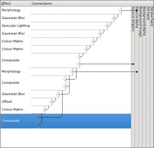
Screenshort of the wiring for the Mauveweb logo filter

Websites I've worked on

I was pondering recently about how many websites I've worked on over the years. A lot of the experiences I've taken away from those websites is now so routine I don't even think about the actual experiences I've had. But I like to look back from time to time and think about how far I've come.

Websites don't usually include credits other than an attribution in the footer. So this is a list of the websites I have personally been involved in (that I can remember at the moment).

  • Abacus Marketing
  • Active Fire Management
  • Ad Media Cover
  • Aldershaw Tiles
  • A M Skips
  • Ashdown Leisure
  • A&S Tooling
  • AV Electronics
  • Beautycube
  • Benalcosta
  • Best Magnets
  • Blah Blah Blah Lifestyle Management
  • Cambridge Garage
  • Charles Peck
  • Chichester Cinema
  • Chris Dawson Associates
  • Cliffords of Brighton
  • Cobasco
  • CUSC
  • Cyprop
  • Decoration By Design
  • Demolition Paintball
  • Design LSM
  • Dijon Miniatures
  • Direct AIM
  • DK Beer
  • Duropal
  • Echit
  • EMS Medical
  • First Finance
  • Fitness First
  • Freestyle Off-road
  • Gary Richard Homes
  • Glenn Freight
  • Global Guidebook
  • Gold Arts
  • Go Letting
  • Guitar Junction
  • Harbour Freight
  • Heritage Photo Albums
  • Hildenborough Volvo
  • Hybrand
  • Impact Promotional Workwear
  • Impact Uniforms
  • In-House Design
  • Joe Macari Cars
  • Just Computing
  • Kingscroft Volvo
  • Kylie Kanga
  • Lara Marketing
  • Limpio Group
  • Limpio Office Solutions
  • Locations In The Sun
  • London Property Finders
  • Lucy In Paris
  • Marshalls Volvo
  • MICE Intranet CMS
  • MICE IT
  • Motor Trade Link
  • Neal Smith
  • Northshore Yachts
  • Nutravida
  • Parkside Cars
  • Peter Taylor Associates
  • Peugeot Express
  • Photography2You
  • Pick A Point
  • Picture Find
  • Point 2 Point
  • Pope Consulting
  • Port Agric
  • Portsmouth Grammar School
  • Protech Component Consultants
  • Provincial & Western Homes
  • Railtrack Plc. Intranet
  • RROOPP
  • Saje uPVC
  • Shoes 4 All
  • South East Labels
  • Southern Counties Fuels
  • Southern Counties Glass
  • Stickwise
  • Tempcon
  • Temple Mews
  • The Icon
  • The RM2 Partnership
  • The Top Edge
  • Top Brass International
  • Top Sinks
  • Trinity College, Cambridge
  • Turbosound
  • Urgent Fuel Oils
  • Wadhurst Country Services
  • Weybridge Group
  • Wood Wharf
  • Yacht Solutions

Defensive Design for the Web

Among the many web development books in my library is a book called Defensive Design for the Web which I bought a couple of years ago. It's a catalogue of usability tips, complete with examples of websites successes and failures. I strongly recommend it to anyone who programs web applications.

A lot of web usability is common sense, but when you compile all that common sense into a book, it's an extremely valuable reference.

CV2 versus Confirmation

The PCI DSS is clear on how to handle CV2 (also known many other acronyms: CVV, CVV2, CVN, CCV, CVC). You may not store this number "subsequent to authorization", not even encrypted. This means the number is highly sensitive. It is treated as the one true anti-fraud measure for Cardholder Not Present transactions. Of course, this is slightly odd - it's written right there on the card for any old waitress to see - but the Payment Card Industry makes the rules and this is the rule they've set.

The user friendly model for e-Commerce payment is this:

Confirm these purchases -> Enter credit card details -> Please confirm that all of the above is correct -> Thanks, here's your order confirmation.

The final confirmation is vital for making sure customers are informed about exactly what they're agreeing to. Customers, en masse, are stupid, and they often get to this stage before realising they've messed up something. The difficulty then is that the request where the web application received the credit card details is different to the one where the customer authorises it to go ahead. This means that the credit card details must persist for at least one request. In the unhappy world of statelessness that is HTTP, that translates as 'indefinitely'.

To investigate how other software tackles this I've come across a startling lack of awareness in open-source shops.

First I looked at Satchmo. Satchmo stores CV2 unencrypted in the database. I couldn't see any code that deletes it after authorisation. It also stores the card number (PAN) encrypted symmetrically with a key from the settings file. This is incredibly naïve! A compromised server would compromise the card information for the entire order history.

Then I looked at osCommerce. Unbelieveably, osCommerce appears to return the CV2 to the customer... in the address bar! Where it will be stored in the browser's unencrypted history for maybe 90 days.

These are the technical options as I've thought of so far:

  1. Send a PreAuth request to the gateway when you have the details and a PostAuth when they confirm. I had thought this was the unequivocally correct way - now I'm not sure. A PreAuth request isn't an uncommitted payment authorization: funds are reserved on the card when the PreAuth is requested. Moreover, if there is an error on the confirm page that affects the amount to be billed, you need to re-request the card details. In essence, a PreAuth is a more binding transaction than the customer feels they have entered into at this stage.
  2. Encrypt the card details with symmetric encryption and send them back to the browser in a hidden field. This is quite elegant, in that it remove the specific problem the PCI DSS is trying to tackle: that a compromised server potentially compromises all credit card details held. It's still encrypted storage, though in this form it may well fall under encrypted transfer. It's permissable to transfer CV2s as necessary, provided there's strong encryption.
  3. Encrypt the card details with symmetric encryption as above but keep the encrypted blob and give the user the key. The cryptographic strength of this protocol is only as good as the previous if the keys are cryptographically random, but it is what the PCI DSS mandates you don't do, assuming the strictest intepretation of the standard.
  4. Only request the CV2 on the confirm page. This could seem quite natural, if expressed as "Please enter your CV2 number for this card to confirm the transaction". It doesn't really help secure the other card details.
  5. Don't show a confirm page, or at least combine the confirm page with the form to submit credit card details, and add a big red button saying "Place this order".

Given these the only option that I am personally happy with is 2 so that is what I intend to implement. I don't like the PCI DSS, incidentally. I don't like global financial companies mandating what the little people must do to protect their profits. I don't like the way it's written - describing what you mustn't do without offering it's view of approved methodologies. I think it's paranoid about network security, it overstates the benefit of firewalls, and it's not comprehensive enough about application security. But I like security and I'm tolerant of this PCI DSS for that reason.

I'd very much like to hear if anyone has a better solution or a different opinion.

Tip: Rectangles With Rounded Corners

When in 1981 Steve Jobs said that "Rectangles with rounded corners are everywhere" he began a trend which today sees dozens of rounded rectangles on millions of PC screens almost all the time.

On the web the situation is even more desperate. Bound by the available technology, and aiming towards intuitive and usable HCI, designers often draw on rounded rectangles to make functional layouts appear more friendly and personal. More than that, using rounded rectangles is perhaps the simplest way to design a site that isn't just boxy and dull.

In CSS, there are two well-known approaches. The fluid-width approach is to stick small graphics of rounded corners into each corner of a box - these cover up the box's corners and make it appear round. The fixed-width approach is to have top and bottom images that comprise the corners, and a tiling background to blend between the two. CSS3 offers an improved background model that will render these hacks unnecessary.

Rounded rectangles in CSS2

Of course, it's not necessary to stick to plain rectangles: using the above approaches, it's possible to decorate them with drop shadows, highlights, stripes, cutouts or whatever else you'd like to. These aren't just techniques for cutting corners - they generalise to techniques for decorating web-based boxes.

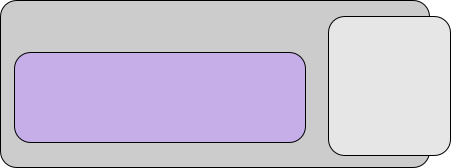
There are some caveats with nested rounded rectangles that you should watch out for. This is how nested boxes with rounded corners should appear.

Rounded rectangles done right

The arcs for all the nested rounded boxes that share a corner should be arcs of concentric circles. In practice, this just means tweak the radii until they look right - so that they appear to focus on a point. Any square boxes should fall inside that focus.

Notice in the diagram below how square corners don't work unless they are inside the focus. Nesting rounded boxes inside square boxes is an absolute don't. A more common mistake is to use the same corner radius for an outer rounded rectangle as for a nested one. Most tools preserve the setting for corner radius, and that's not what you want. Notice how the outer box appears proud in the diagram below, right (cf. above, left)

Rounded rectangle mistakes

Notice below how when the boxes don't share a corner, you can use the same corner radius, but the effect is slightly different. Using the above rule-of-thumb throughout will keep the design a little more down-to-earth.

When you can use rounded corners with the same radii

IE8 actually does not pass Acid2

I've just been reading the latest goss on Acid3 and I've come across the most wonderfully perverse announcement from Microsoft (this is a few weeks old, but it's not like I regularly read Microsoft blags).

Since announcing that IE8's renderer can pass Acid2, it transpires that they have a Catch-22:

To have IE8 conform to standards, you have to use a non-standard workaround.

Wow. I'd assumed Microsoft knew what standards were but couldn't seem to achieve compliance. Not so! Turns out they can achieve compliance but they don't know what web standards are!

Negative Tabs

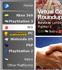
On a couple of websites I've noticed an unusual style of side tab which oddly doesn't seem to conform to the "tab" metaphor and which I find oddly baffling to use:

Monster.co.uk inverted tabs

Eurogamer Inverted Tabs Jakob Nielsen offers 13 design guidelines for tabs but this is not covered. Not only does the the shape fail to convey these are tabs, the rounded corners appear to emphasise the deselected tabs over the selected one. It's as if the selected tab is cut out from the set. Only a very slight change to the shape or shading would make these apparently negative tabs pop out, and usability would return.

Exploring publishing models

I have been increasingly drawn into the world of blogging over the past few years. It is sometimes claimed that the blogosphere represents an information publishing revolution, and I wouldn't disagree. Blogs are, in their simplest terms, a simplified content management system that has very simple and clear semantics and a very low barrier to entry. I sell customised blogs to my clients on exactly that basis. They are the cheapest websites we can offer.

Blogs are a trade off. Blogs make publishing easy, but the value of the collected content doesn't increase as fast the quantity of posts increases, not in a single blog nor in the blogosphere as a whole. The archives of the blogosphere are hard to navigate. Where information can be found it may be wrapped up in reams of prose or buried way down in the comments. Most of the value of a blog lies in the most recent posts - the ones advertised at the top of the first page and the RSS feed. This, of course, is perfectly suited to news.

One comparison I could draw is with wikis. Wikis offer collaborative editing and this tends to increase the quality of the content as a whole (if the rate of improvement outpaces the rate of vandalism). Wikis are as a whole more up-to-date than blogs too, because old articles linger indefinitely in the archives of blogs, whereas wiki pages are replaced in situ. Personally I find a single wiki - Wikipedia - more useful than the entire blogosphere. It's a very complex comparison to draw and an endlessly debatable one, but wikis offer a model which allows discussion or documentation of topics which are deeply interwoven - which is almost everything. Blogs mediate the actual mechanics of a single discussion better.

For professional publishing, we should try to identify and capitalise on the benefits of both of these models. It's very tempting for me just to tack a blog onto a finished website so there is a channel for the owners to communicate with users, but lots of professional sites end up fronted by a rather dull blog, filled with unedifying news and other tidbits the authors think might engender some interest or at least turn up in search results. Instead, the heavily hyperlinked nature of a wiki could allow visitors to click from this sequential news to in-depth information, and collaborative editing (internally not publically, of course) could increase the quality of the content they find better than a shallow hierarchy of authors and editors.

I'd be interested to know if there's an advantage to releasing content in "issues" like a magazine. I wonder in particular if visitors can get more engaged in a site when it complete refreshes once a week than when there's a slow but steady drip of articles. Not a great proportion of sites do this although I can think of a few (The Onion, Linux Gazette). By publishing in issues your RSS feed becomes an invitation, not a medium in itself, an approach which would partly quench my long-standing gripes about RSS. But spending a fortnight writing and editing articles could be much more valuable than a constant drip of articles. But above all it could allow time to create unique and engaging graphic design for dynamic content, a holy grail for the web industry, and something I'll talk about another time.