Tip: Rectangles With Rounded Corners
When in 1981 Steve Jobs said that "Rectangles with rounded corners are everywhere" he began a trend which today sees dozens of rounded rectangles on millions of PC screens almost all the time.
On the web the situation is even more desperate. Bound by the available technology, and aiming towards intuitive and usable HCI, designers often draw on rounded rectangles to make functional layouts appear more friendly and personal. More than that, using rounded rectangles is perhaps the simplest way to design a site that isn't just boxy and dull.
In CSS, there are two well-known approaches. The fluid-width approach is to stick small graphics of rounded corners into each corner of a box - these cover up the box's corners and make it appear round. The fixed-width approach is to have top and bottom images that comprise the corners, and a tiling background to blend between the two. CSS3 offers an improved background model that will render these hacks unnecessary.

Of course, it's not necessary to stick to plain rectangles: using the above approaches, it's possible to decorate them with drop shadows, highlights, stripes, cutouts or whatever else you'd like to. These aren't just techniques for cutting corners - they generalise to techniques for decorating web-based boxes.
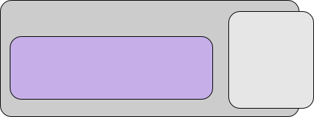
There are some caveats with nested rounded rectangles that you should watch out for. This is how nested boxes with rounded corners should appear.

The arcs for all the nested rounded boxes that share a corner should be arcs of concentric circles. In practice, this just means tweak the radii until they look right - so that they appear to focus on a point. Any square boxes should fall inside that focus.
Notice in the diagram below how square corners don't work unless they are inside the focus. Nesting rounded boxes inside square boxes is an absolute don't. A more common mistake is to use the same corner radius for an outer rounded rectangle as for a nested one. Most tools preserve the setting for corner radius, and that's not what you want. Notice how the outer box appears proud in the diagram below, right (cf. above, left)

Notice below how when the boxes don't share a corner, you can use the same corner radius, but the effect is slightly different. Using the above rule-of-thumb throughout will keep the design a little more down-to-earth.

Comments
Comments powered by Disqus