Negative Tabs
On a couple of websites I've noticed an unusual style of side tab which oddly doesn't seem to conform to the "tab" metaphor and which I find oddly baffling to use:

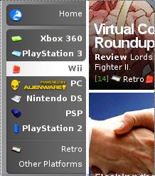 Jakob Nielsen offers 13 design guidelines for tabs but this is not covered. Not only does the the shape fail to convey these are tabs, the rounded corners appear to emphasise the deselected tabs over the selected one. It's as if the selected tab is cut out from the set. Only a very slight change to the shape or shading would make these apparently negative tabs pop out, and usability would return.
Comments
Comments powered by Disqus