The dangers of double resizing
Amazon have made a bit of an mess of building their thumbnails. On their homepage I was greeted with these:


The moiré pattern of blurriness is an artifact - evidence of the fact that these "Look inside" thumbnails are caused by resizing already thumbnailed images - probably the thumbnail of the book cover without the "Look inside" banner. To avoid this on your sites, you need to build thumbnails from a sufficiently high-resolution image - ideally a high-resolution original. In practice, it can be faster and less memory-hungry to thumbnail from a medium-sized image, and this will generally not show visible artifacts. Of course, if you've already got a high-resolution image loaded into memory, you can side-step all of the quality issues by building all of the thumbnails you might need from it at once. Note also that you need to resize down enough to hide any JPEG compression artifacts.
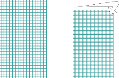
To understand how the tell-tale moiré pattern comes about, let's imagine the source and destination pixel grids:

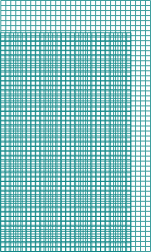
When we overlay them you can see the moiré pattern appearing.

Where the grid intersections are aligned, one source pixel maps fairly closely to a destination pixel, which makes that spot in the thumbnail crisp. But as you move away from those spots and the error builds up, the grid intersections disalign, and one source pixel is smeared over four destination pixels. That makes for a blurry spot.
Comments
Comments powered by Disqus