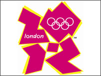
2012 Olympic Logo

I'm watching the London 2012 logo fiasco with interest because it's very rare for the public to take an interest in graphic design in this way. The criticism of it has covered almost every aspect, and there are remarkably few people who actually like it. This logo represents £10 billion of investment so it's crucial that they get it right. On that basis, £400,000 isn't unreasonable.
If we are talking about a budget of £400,000 for just the branding (and I believe that figure covers the production costs for the entire marketing campaign), we're in a very different league to the kind of ad-hoc logo design I usually deal with. Normally with logo design, I come up with a few ideas, as different as possible, based on what I perceive the brandee's identity to be, and there's usually one or two in there that are decent enough for the client to want to run with.
Trusted with a budget as large as this, and forced to provide some measure of accountability rather than just using Inkscape's random polygon tool and stuffing the cash into my pockets, I would probably conceive of a procedure like:
- Write down design criteria that the marketing campaign must meet, both at a technical and an aesthetic level.
- Production of a whole load of logos that meet the formalised criteria.
- Allow LOCOG to narrow it down to a few candidate logos.
- Pitch each campaign and logo to a separate focus group comprising a proportion of foreign nationals, Brits and Londoners, to judge public response to each. At this stage, you can not only ask whether they like it, but actually collect feedback on how it can be improved.
- Repeat steps 3 and 4, unless the response is so poor that you have to return to step 2.
I cannot imagine that this logo has come through any such process. Focus groups are cheap and they can prevent mistakes which cost millions! I can conceive of how the graphic designer might submit this to LOCOG, but not how this could have been selected as the final logo unless the alternatives were truly dreadful, but that does not constitute endorsement and focus groups responses would have reflected that.
I would envisage that design criteria for any Olympics logo would be along these lines:
- MUST incorporate the Olympic rings device unaltered and preferably in full colour.
- MUST incorporate the name of the host city in legible roman script, and optionally local script.
- MUST incorporate contain the year 2012 in legible Arabic or Roman numerals.
- MUST NOT incorporate other text.
- MAY convey a mild national theme or style, contemporary if possible.
- SHOULD convey athletic achievement and/or Olympic tradition.
- SHOULD remain identifiable as the Olympic logo regardless of treatment, orientation and low-fidelity reproduction.
- MUST NOT exhibit any image likely to cause offense to any group, particularly with a view to avoiding cross-cultural faux pas.
- SHOULD NOT exhibit anachronism.
- SHOULD be distinctive, worldwide.
Comments
Comments powered by Disqus