Exercise: Recreate an attractive website

I pick up a fair bit of business from companies that already have a website created by, say, the boss's son's friend who has gone off to university, but also I'm forced to use hundreds of websites that have cringingly poor design or cripplingly poor usability. I am very supportive of amateur and beginner web designers striving to improve, but when I browse the web it's obvious there are still very many web designers who don't understand what they need to do to improve, and turn out poor websites time and again. It's a widening gap: while the beaten track consists of websites that scream 2009 in both look and feel, many amateur websites are stuck in 1999.

Anyone interested in learning to design websites would do well to study the existing web in a bit more detail - look and learn, as well as practice! I'm going to present a simple exercise a web designer of any level can benefit from.

Instructions

  1. Choose a topic. Perhaps a hobby, or a movie; something you are passionate about is best, but definitely something that you can write at least a few pages about.
  2. Pick a website you personally like a lot, but nothing too simple. The idea is to stretch yourself, so pick something elaborate.
  3. Use the design of the website you have chosen as the template for a new website about your chosen topic.

What you need to end up with is an attractive website that takes a lot of inspiration or perhaps even outright rips off the website you chose as a template - but recreated from scratch. It's OK to explore a variation on the style, but don't skirt around some aspect that looks difficult. That's cheating. You might like to source images using Google or from a stock photo website like iStockphoto.

Pepsi Rebranding

There's a hilarious document doing the rounds after turning up on reddit: a document detailing why Pepsi's new brand identity is so good. In terms of general relativity. And smileys.

Pepsi Rebranding Advice (PDF, 6MB)

As I've pointed out previously, the criteria for whether a logo is an improvement are whether it meets the design criteria and then whether you get positive feedback from focus groups. This 27-page document full of guff, if authentic, seems to have convinced the board of PepsiCo, who on this evidence must be credulous idiots. What would convince me is a 27-page document showing that a significant majority of a representative group not just like the new logo, but can associate it with the product they already know, and the values the brand is seeking to convey.

The new logo doesn't seem to have hit the UK yet, so here it is if you've not seen it:

Pepsi's New Logo

It's not a bad logo in itself. But it's no longer as unique and iconic as the old one had become. It reminds me a little of the Sony-Ericsson logo (which is prettier). The new packaging looks almost like own-brand supermarket cola. I'm sure Pepsi will throw money behind promoting this new logo. But it's money they did not need to spend. They already had a distinctive and versatile logo.

Sky News

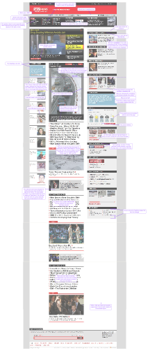
I don't watch Sky News but in Googling today I happened to stumble onto their site. I was amazed how poor it was compared to the BBC news website that I visit whenever I do want news.

I've annotated a copy of the Sky News homepage as of 2009-02-06 with my comments on the graphic design. This is very similar to the way I actually work when I'm working with a designer. Click the image below to embiggenify.

A critique of Sky News' graphic design (Image-heavy SVG)

Profanity

The web has never responded very well to censorship. So much of the web is about freedom of expression that whenever someone tries to express himself, and is prevented from doing so, he feels disenfranchised. That applies even more so in the case of the Scunthorpe problem, because people who weren't trying to swear in the first place feel much more aggrieved.

On the other hand, website owners do not want their image damaged by users who can't keep their potty mouths shut.

When developing sites that allow users a voice, we need to find ways to protect the website owners, or the atmosphere of a community, without damaging the goodwill of the user base. Any website that depends on user input, and which doesn't have any users, is a failure.

Profanity filtering is not the answer because, at least, I've never seen it done well enough to be both comprehensive and unintrusive. All problems that relate to processing natural language are extremely complicated. We have barely started to scrape the surface in terms of parsing English text, let alone extracting the semantics from it that we would need to determine if a word is offensive. So any attempt at a naïve profanity filter is doomed to failure. For example, you can be profane without being offensive:

She turned round and screamed, "Fuck off, you stuck-up bitch". I was appalled!

You're a grumpy old bastard, but I love you.

and you can be offensive without being profane:

I did your mum last night. She's fatter than a blue whale, but she knows a trick or two. Your sister does too actually.

and let's not forget the cases where you can't tell:

Do you have a cock or do you just keep hens? Oh, we have a big gold cock. You know, the pussy is afraid of him!

Ok, the last example is contrived and of course nobody would type it with a straight face.  Still, in the right context, it's innuendo not profanity.

With those insurmountable problems, there's simply no substitute for a human keeping an eye on things. However, even with moderation, there are problems to face. Exactly what is acceptable? Moderators can easily pronounce on clear-cut cases of abusiveness or offensiveness, but people have different sensibilities as to what's acceptable. It's also fairly easy for moderators to miss the odd bit of abuse, especially if it's only offensive in some contexts.

One trick to help keep control of the situation is to carefully set the tone. If you can use the language and style of the website to convey a sense of what might be appropriate, you can influence the tone users are likely to take. Though moderators still have to check the same amount of content, this reduces the chance that something untoward will slip through. Phrases like "Interglobal Inc do not take any responsibility for the content of this service"  - phrases which are of dubious merit anyway - may have the opposite effect, by giving users the impressi0n that they don't care what the tone is. You also stand to lose control of the tone in the subconscious minds of users if you use some well-known software - phpBB for example - which users might have used elsewhere and come to associate with a certain mode of speech.

If you do censor people,  a light touch is often better than a heavy hand.

How to program a calendar

Programming a calendar sounds deceptively easy. And it is, until you come to realise that there's very little point in displaying a calendar that doesn't show information about events and periods. You have a potentially overlapping set of periods to display, each spanning days or months. It becomes much more complicated.

At the moment I'm programming a calendar for the booking of accommodation, which is particularly complicated because a) you book nights, not days, and month planners have cells for days, not nights, and b) the dates that are available are the dates not booked, not the dates booked.

I'm using a simpler approach, converting all calendar periods into a stream of events in date order. The interface between producers and consumers of calendar events looks like this:

class CalendarListener(object): def start_month(self, month): """Called before the first day of the month, and before any periods in that month."""

def end_month(self, month): """Called after the last day of the month, and after any periods in that month."""

def start_day(self, date): """Called once for each day to display"""

def start_period(self, date, period): """Called before the day in which the period begins"""

def end_period(self, date, period): """Ends the previously started period"""

This interface makes it very easy to produce, filter, and consume calendar data. What was previously a complicated process of intersecting, splitting, joining, structuring and outputting date ranges suddenly becomes very simple. All of the events received via this interface are guaranteed to be in chronological order, so no date comparison is needed. Almost all calendar operations can be performed with a simple state machine.

A consumer that renders to HTML, for example, is as simple as this:

class MonthRenderer(CalendarListener): def init(self): self.buf = StringIO()

def start_month(self, month): print >>self.buf, """

%s
""" % month.name()
w = month.first_day().weekday()
if w:
  print &gt;&gt;self.buf, '<div class="padding" style="width: %dpx"></div>' % (w * 21)

def end_month(self, month): print >>self.buf, "

"

def start_day(self, date): print >>self.buf, '%d' % date.day

(Note: date and datetime are standard Python classes. Month, however, is my own class. Also, some people use a table rather than CSS for this; that's obviously a fairly simple alteration.)

It took me quite a few false starts before I realised the relative simplicity and convenience of this pattern, which is why I wanted to recommend this. It's very easy to fall into a trap of building complexity and tackling problems using ever-more complicated calendar classes and processors and never take the step back to find a better approach.

The naïve approach for programming a calendar is to write a function, say, print_month() which renders a month of a calendar. Then call this 12 times. Then wrap it up in a class so you can subclass it to retrieve a list of events and modify output. This quickly became excessively complicated, as I wrote methods to chop and join periods together, work out what the formatting of each day should be, and render it.

Alas, the calendar also requires Javascript, and doesn't benefit quite as much from an event-driven approach because it needs to operate on the structured HTML DOM.

Tip: Don't use uppercase/lowercase in HTML

It's sometimes tempting to use case for emphasis: uppercase and lowercase are well within the repertoire of useful graphic design tools. Graphic designers know that uppercase is slower to read than lower case, but in isolated phrases that's unimportant. But on the web there's a penalty to using just upper- or lowercase: it's not as accessible. Writing in normal sentence case conveys information. Specifically, the semantics of the sentence - particularly abbreviations - depend on the use of case, as this photo shows:

NUT CONFERENCE

CSS provides a way around this: the text-transform property. This allows you to write your content in full-sentence case, and display it in full uppercase or lowercase as desired for stylistic reasons. For example, if your design calls for <h2> tags to be in uppercase, use

h2 {

text-transform: uppercase;

}

Of course, this allows you to simply remove the property if you change your site design; no content needs to be rewritten.

Some offenders even publish an RSS feed using uppercase titles. Never do this. People who want to syndicate your feed normally want it in sentence case, and there's no way to force that to happen if you aren't publishing the RSS feed using proper sentence case.

Wordpress Audio Player

Martin Laine's Wordpress Audio Player seems to have quite a broad penetration, but having seen it in a couple of places, I want to add that I think it's an excellent. When not playing, it's a plain, unintrusive icon that clearly indicates an option to play a sound, and which smoothly expands to a straightforward, clutter-free player. By changing the colour scheme, you could make this fit with nearly any website style, and unlike many alternatives it will not draw attention away from your text or audio content.

Users don't need WYSIWYG

We've all been wowed by impressive off-the-shelf components for WYSIWYG editing in webpages. TinyMCE and HTMLArea are just two. Looking at them it all looks staggeringly simple.

However, in practice these editors become incredibly painful to use. When you watch users trying to edit a content management system, it becomes very obvious that the usability they profess is an illusion.

  • The editing experience is slow, sometimes to the point of non-interactivity
  • Loading of the component is also slow
  • Users struggle to make formatting behave when all they want to do is write
  • Pasting from word processor documents also pastes unwanted formatting

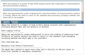
My solution is to return to the humble textarea. This was something I discovered by accident: Django provides a Markdown filter, so this was the simplest way to provide formatting, though my intention had been to embed TinyMCE later. Markdown is a simple formatting language based on formatting conventions in plain-text e-mails. I soon discovered the convenience of editing content with Markdown - freed from worries about formatting, the experience of publishing content accelerates, at the expense of a slightly steeper learning curve. It's only a learning curve for the formatting features. In the simplest case of unformatted paragraphs, writing in Markdown is the same as writing in plain text, so users can start publishing at full speed straight away.

There's also the benefit that Markdown doesn't give users the ability to break out of the style of a site. Users are not graphic designers: if you give them the ability to make text red, thinking perhaps that this may be useful on special occasions to draw attention to an important message, don't be surprised if they make every other sentence red, bold and italic. After all, they want to draw attention to everything they say, don't they?

To enhance the experience in my applications, I've bolted on a toolbar based on Livepipe and a preview based on Showdown.

Screenshot of my MarkdownArea

Calls to action

A way of supposedly increasing the conversions from your site is by adding calls to action, links or banners or buttons nudging people away from simply reading and towards taking action - purchasing your products, enquiring about your services and so on.

The practice of including calls to action is taken straight out of the advertising industry. Advertisers have a small list of things that they need to include in an advert, and a call to action is on that list. However a website is not an advert. Users browsing the web are mainly in a mode where they will read and compare and research a purchase. Who would click the first "buy this now" button they see when they can hop onto another site and check out alternatives and price first? In this context, calls to action may not be very effective and can be intrusive. It's even less effective if your call to action is not something as passive and easily handled over the web as just "buying", such as "Enquire now about our calibration service".

In the UK we also like our calls to action implicit. Watch TV ads for a few minutes and the number you'll see that include an explicit call like "Sofas half price at DFS until Monday! Come down to DFS showrooms today!" are small compared to the number that run more along the lines of "The sun is shining and this man in trendy clothes is laughing with a group of attractive women. What's that he's drinking? Oh, Coca-cola."

So include calls to action, make sure they are seen, but keep them understated and out of people's faces and users may find your site that much more appealing - easily enough to outweigh the effectiveness of intrusive calls to action.